How to do design QA with AI: a 6-step workflow that catches what humans miss
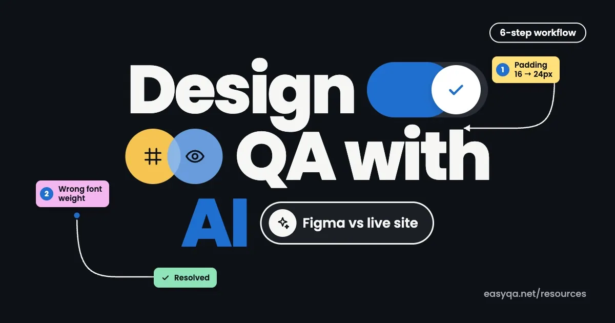
Use AI to check the design file before handoff, compare the live build against the design, run an automated audit for contrast, fonts, spelling and dead buttons, then turn every finding into a pinned comment that gets fixed and checked again. AI does the scanning. You make the calls.

Learning how to do design QA with AI starts with one number: 83.9% of the top million home pages shipped low-contrast text in 2026. That's a design bug, and it's exactly the kind a machine spots in seconds.
What is design QA with AI?
Design QA with AI means using AI tools to compare a design with its built version and flag the gaps: spacing drift, wrong fonts, off-brand colors, contrast failures and missing states. The AI finds and documents issues fast. A designer still decides which ones matter and approves each fix before release.
Why manual design QA keeps missing things
Manual design QA is slow. And slow review gets skipped when a deadline hits.
Skipping it costs real money. IBM's Systems Sciences Institute research, as summarized by Global App Testing, found that a bug fixed after release costs four to five times more than one caught during design. CloudQA's report says development teams spend 30 to 50% of their time on bug fixes and unplanned rework.
Design is a big source of those bugs. TestDino's defect breakdown puts design errors at roughly 25 to 30% of all defects, almost the same share as code errors.
Then there's the human eye. By the fourth pass on the same page, you stop seeing a 4px gap or a #333 that should be #1F1F1F. A model doesn't get tired. It checks the 40th button the same way it checked the first.
It's also getting worse. Reports on the WebAIM Million counted 56.1 accessibility errors per home page in 2026, up 10.1% from 2025, and 95.9% of pages had at least one detectable WCAG failure. Most of those are visual problems a designer could have caught.
What AI is good at in design QA (and where it still fails)
AI is strong on anything you can measure. It's weak on anything that needs context about your users or what the brand is trying to say. Even Figma says pairing AI audits with manual review gives you the most complete picture.
| Design QA task | Can AI handle it? | Who should own it |
|---|---|---|
| Color contrast against WCAG | Yes | AI flags, designer confirms |
| Spacing, padding and alignment drift | Yes | AI measures, designer approves |
| Font family, size and weight mismatches | Yes | AI |
| Spelling and copy typos | Yes | AI |
| Buttons and links that go nowhere | Yes | AI |
| Hover, focus and empty states | Partly, if you show it the state | Designer |
| Visual hierarchy and overall feel | No | Designer |
| Brand tone and product claims | Weak | Designer or marketer |
The pattern is simple. Let AI own the measurable checks and keep the judgment calls for people.
How to do design QA with AI in 6 steps
This workflow fits a small product team: one designer, a few developers and a staging site. Bigger teams can run the same steps per squad.
1. QA the design file before handoff
Start in Figma, where fixes are cheapest. Figma's built-in agent checks spacing, alignment, component usage and design system compliance right on the canvas. It's available on all paid Figma plans, and during the open beta it doesn't use AI credits.
Give it a specific job. "Check this checkout flow for spacing that isn't on our 8px grid and any text style that isn't in the library" works far better than "review this design."
Bringing QA this early pays off. Ramotion describes a fintech team that cut design rework by about 40% after inviting QA into design workshops and adding token checks.
2. Review the real build, not screenshots
Once developers push to staging or localhost, review the live page in a browser. Screenshots hide hover states, scroll behavior, sticky headers and breakpoints.
EasyQA's free Chrome extension works on staging sites, localhost and pages behind a Google or Microsoft SSO login, so you can review before anything goes public. Freeze hover pauses a dropdown or tooltip long enough to comment on it.
3. Overlay the design on the build
This is where most drift shows up. Load the design and lay it over the live page, or swipe between the two. A 2px baseline shift or a button that grew 6px wider is obvious in an overlay and almost invisible side by side.
In EasyQA, Compare and Overlay saves one design per page and device inside the report (Pro and Team plans). Inspect and measure reads fonts, colors and contrast, and measures padding and gaps on the element, so your comment can quote exact values instead of "looks a bit off."
4. Run an automated audit
Let AI do the boring sweep. EasyQA's one-click page audit flags buttons that go nowhere, spelling mistakes, stray fonts and SEO issues, then scores the page out of 100. Run it again at tablet and mobile sizes with device preview.
Look hardest at contrast. The 2026 WebAIM scan found an average of 34 low-contrast instances per home page, so it's the failure you're most likely to hit.
5. Turn findings into pinned comments
An issue nobody can find again won't get fixed. Tick an audit finding and it becomes a comment pinned to the exact element. Every comment saves its own screenshot plus the OS, browser, resolution and viewport, so the developer never has to ask "which device?"
Set a priority, assign it to someone, and share one link. Clients and teammates can comment without an account.
6. Let an AI agent fix comments, then check again
Connect Claude, ChatGPT or Codex to EasyQA through MCP once. If the agent built the page as HTML (a landing page draft or a prototype, say), it can deploy it to EasyQA, read the open comments, fix them, reply, resolve each one and publish a new version to the same link. It works on every plan, including Free.
Don't skip the human pass. Open the new version, check every resolved pin, and reopen anything that still isn't right. An agent marking its own work as done is a starting point, not a sign-off.
Design QA checklist for AI-assisted reviews
Run this list on every page, whether the AI or a person does the checking. Body text needs the WCAG AA contrast ratio of 4.5:1.
Want the longer version? Our design QA checklist has 30 checks you can tick off and download as a PDF.
AI design QA tools compared
| Tool | Where it works | Best for | Starting price |
|---|---|---|---|
| Figma agent | Inside Figma files | Pre-handoff checks against your design system | Paid Figma plans |
| EasyQA | Live sites, staging, localhost, photos and PDFs | Build vs. design overlay, page audits, pinned feedback, MCP agent fixes | Free (3 reports), Pro from $9 a month |
| Claude or ChatGPT with screenshots | Any screenshot you upload | Quick critique and a ranked list of fixes | Free and paid chat plans |
| Visual regression tools | Your CI pipeline | Catching pixel changes between code versions | Check each vendor |
Most teams end up using two of these together: one inside the design tool and one on the live build.
Common mistakes when doing design QA with AI
- Trusting the score. A 92/100 audit doesn't mean the page feels right to a user.
- Only showing the AI the default state. If it never sees the error state, it can't review it.
- Skipping the source of truth. Without your tokens or the Figma file, the AI guesses what "correct" means.
- Letting the agent resolve its own comments with no human check after.
- Running QA once before launch instead of every sprint, so issues pile up into one painful week.
A prompt you can copy for screenshot reviews
If you're starting with a general AI reviewer like Claude or ChatGPT, this prompt keeps the output specific:
You are reviewing a web page for design QA.
Attached: the Figma export (design) and a screenshot of the live build at 1440px.
Our tokens: primary #2563EB, text #111827, spacing on an 8px grid, font Inter.
List every difference between design and build. For each one give:
the element, what the design shows, what the build shows, and a severity (high, medium, low).
Flag any text that fails WCAG AA contrast. Do not comment on taste.Start your first AI design QA review
Pick one page your team shipped this month. Open it in EasyQA, run the audit, overlay the design if you have it, and see how many issues show up. The Free plan is enough for a first test, and anyone you share the report with can comment without paying or signing up. See everything EasyQA does or compare the plans.
Sources
- WebAIM Million 2026, as reported by Priority Pixels
- WebAIM Million 2026, as reported by ZURB
- Web accessibility statistics 2026 (Digital Applied)
- Global App Testing: the real cost of software bugs (IBM Systems Sciences Institute data)
- CloudQA: the true cost of software bugs
- TestDino: bug cost and escape rate report
- Ramotion: DesignOps and QAOps
- Figma: AI design QA agent
- Figma: AI accessibility checker
- W3C: Understanding WCAG contrast (minimum)
- Rubyroid Labs: integrating QA into the design workflow